The idea of becoming a Free Fire content creator must have stuck around in so many players’ minds. Right, it’s more than just your talented skills as you need to come up with creativity in terms of both core video content and visuals. In case you're not a content creator who majors in graphic design, this article will guide you through how to make a Free Fire montage thumbnail from A to Z.
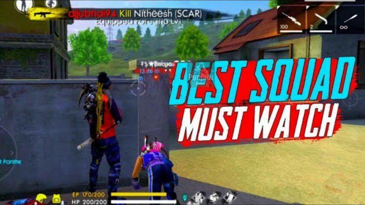
How Important Is The Video Thumbnail?
It comes as no surprise that a lot of audiences only look at the thumbnail photo then decide to click on your video or continue scrolling down. No matter how great your inner content is, you should get along with this fact – the first impression does matter.
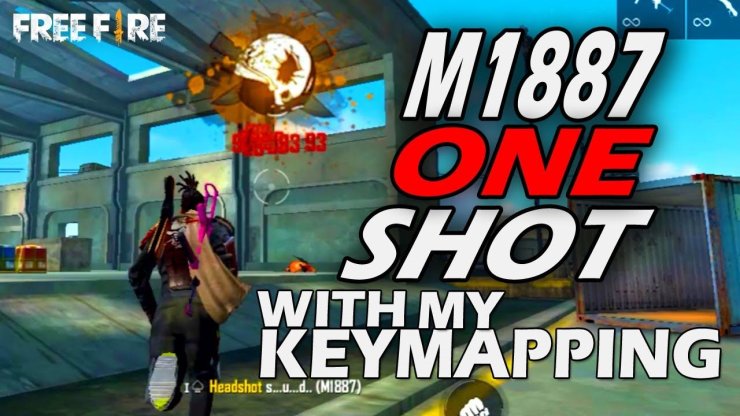
Tips To Create A Free Fire Montage Thumbnail On YouTube
Simply put, there’re some very important things you should keep in mind before creating a thumbnail for any of your YouTube videos. They’re as follows:
- Keep It Simple
Loads of amateur YouTubers write down a whole summary of their videos into the thumbnail pictures, but how will they be paid off?
Let the numbers speak: 70% of watch time on YouTube derives from mobile devices, meaning that viewers cannot read a ton of text in the thumbnails and they’re likely to find it very annoying instead.
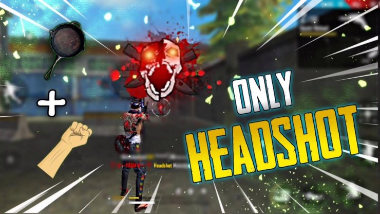
That’s why you should keep it as simple as possible. If you cannot compress your idea into visuals, let’s try to pick out some important words for the title and the background image as well.
- Keep It Relevant
Similar to other search engines like Google, YouTube appreciates the content that gives viewers a direct answer or related information once they type in their queries. Hence, the thumbnail should be made relevant to your video’s main story and should contain a few potential keywords for both YouTube’s assessment and viewers’ attention.
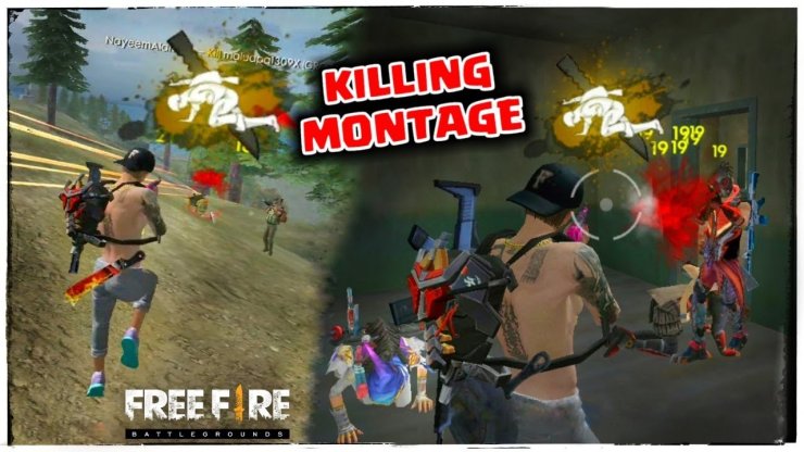
The Free Fire montage thumbnail now becomes an effective way to communicate with your viewers. However, if you just want to lure more and more people into your video but your follow-up content doesn’t meet your own promising words, the video itself will no doubt be engaged with a bad bounce rate. You never want YouTube to rank your video lower in the search results, do you?
- Keep It High Contrast
To really grab attention, you’ll want to use high contrast colors in your thumbnail. No blacks, whites, or reds since they tend to blend in with YouTube’s branding.
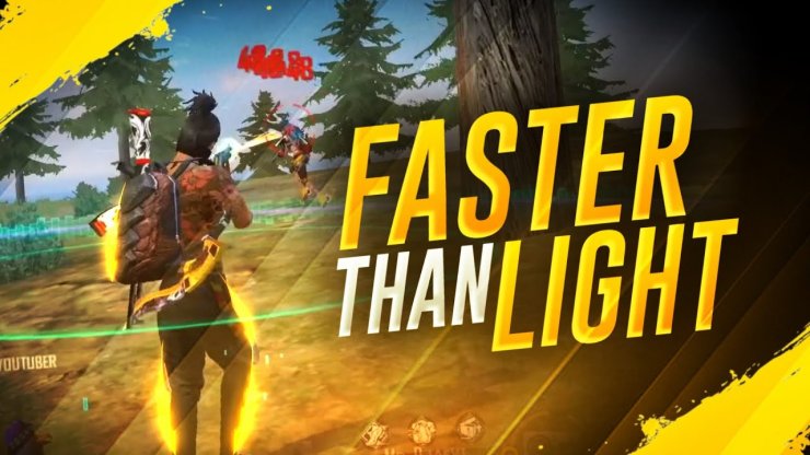
Try sticking with blue, green, orange, and yellow to make your videos pop. You can even search the target keyword for your video and use a color that contrasts with what the majority of your competitors are using.
- Keep It Branded
You’re working with limited real estate, so you may be tempted to leave your logo off of your thumbnails. Don’t do it! Your logo can boost brand awareness. You’ll want to include your logo so that it’s conspicuous, but doesn’t draw too much attention.
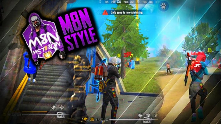
Try adding your logo to a corner of the thumbnail. Don’t add it to the lower right corner, though, or it will be covered by the video length.
Best Apps To Create A Free Fire Thumbnail
The human brain responds better to visuals than texts. Therefore, creating visually appealing YouTube thumbnails can significantly increase traffic to your channel. But having quality thumbnails is not enough – the content needs to be valuable to the viewer for you to have a higher engagement.
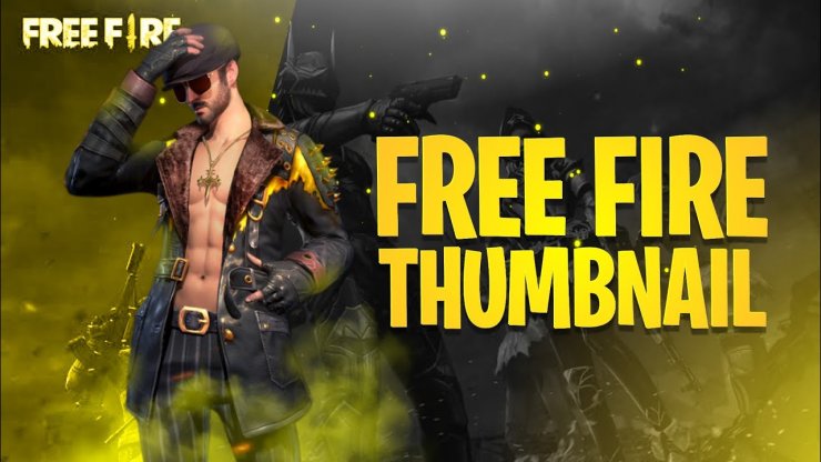
It’s an easy way to make a great first impression and get viewers interested in watching more. And, let’s face it, without an eye-catching thumbnail that entices a viewer to click, even the greatest content is going to be passed by.
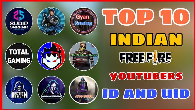
Now that you know what to do to create stunning, attention-grabbing thumbnails, you need the right tool to help you create them easily and quickly. Here are some of the best online YouTube thumbnail makers that a lot of content creators have been using so far.
- Canva
- Adobe Spark
- Fotor
- Snappa
- Visme
- Bannersnack
- Fotojet
- PicMonkey
- PixTeller
- Backgrounder
- Picmaker
- Crello
- PlaceIt
- Pixelixe
- BeFunky
Read More: The Ultimate Guide On How To Play Games On Android TV




Comments